2026
2026

Overview
Winner brand design proposal for Destino Aluminé Brand Design Contest. The brand was presented in the International Tourism Trade Fair in Buenos Aires.
Objective
This brand presents Aluminé as a touristic destination for national and international markets. It looks for differentiating Aluminé from other destinations in argetninian Patagonia.
Reaserch
To elaborate the brand's concept it was important to learn about the place, its geography, history, nature and culture.
I took inspiration from common references in its natural environment and the cultural expresions of the people who inhabit it.
Process
Strokes inspired in mapuche textiles are used as a language to represent the nature and cultural roots of Aluminé. The shapes pay homage to mountain landscapes, rivers, lakes, flora and fauna.
This union between culture and nature guides the central idea of the brand.
Iso y logo
Ñimin Design, figures that mapuche weavers do in their looms. Strokes for the letter Aare built from these shapes.
Pehuén (Araucaria araucana) Emblematic tree form Neuquén Province and Aluminé, and sacred tree for mapuche people. Counterform of the A is taken from the abstraction of "piñon", the tree's seed.
Isotype construction
Logotype - Color
Logotype - Inverted
Color palette
The color palette follows the guidelines of Aluminé's government.
Complementary elements
The isotype strokes can be combined in new shapes, creating patterns and icons related to the brand's concept to be applied in graphic pieces and merch. This way the system keeps felxible and adaptable.
Stickers
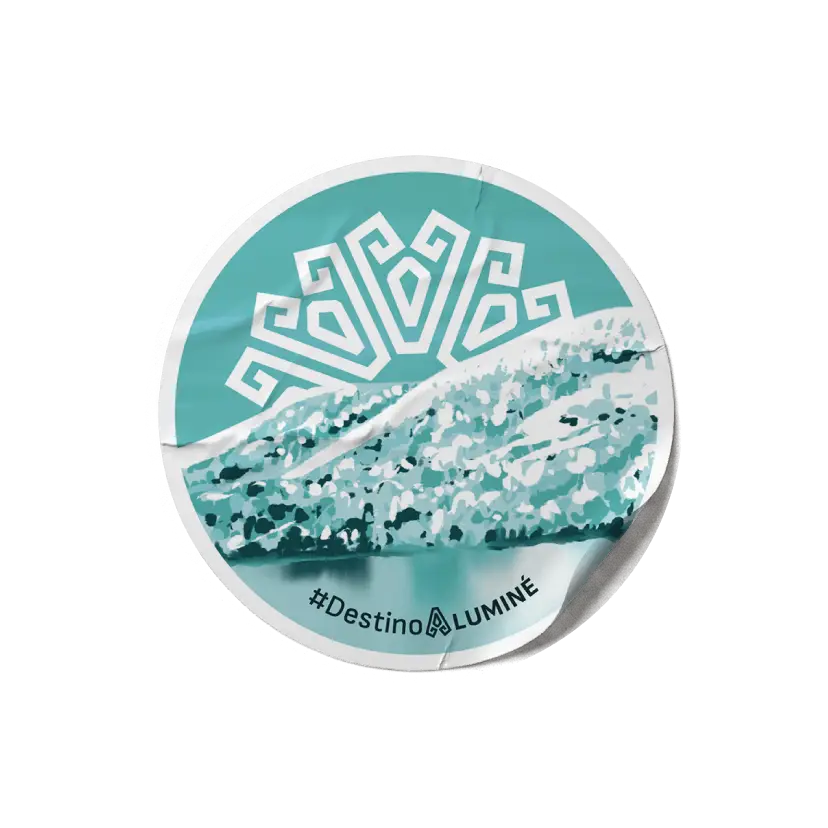
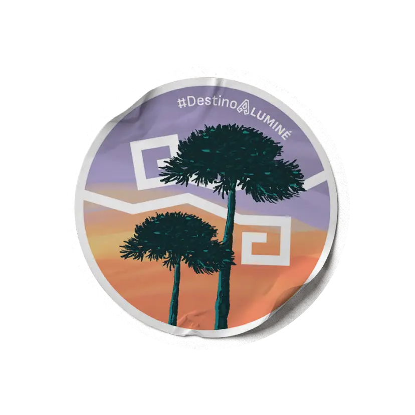
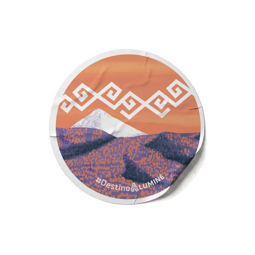
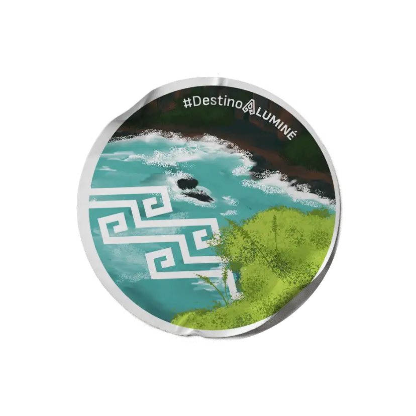
Four sticker designs are included following the brand's system. Illustrations of nature and landscapes in different seasons are combined with brand's elements.
Other applications
The logo and the elements can be applied in different physical and digital pieces.